“Christy and I of the CATugeau Agency want to start by saying we’re thrilled to be the first ARTIST REPS to critique on Kathy’s site. We think this might be a wonderful weekly overall artist learning opportunity to hear what ‘hits’ us with each of two sequential images from the same artist. Look, read and listen to what we share with our honest ‘first impressions’, and see if it might pertain to or help out YOUR images as well. Christy (who is my partner now for two years and my daughter for 35) is tied up this weekend, so you’ll hear only from me, Chris, this week…she’ll join us with following weeks. Now let’s begin….
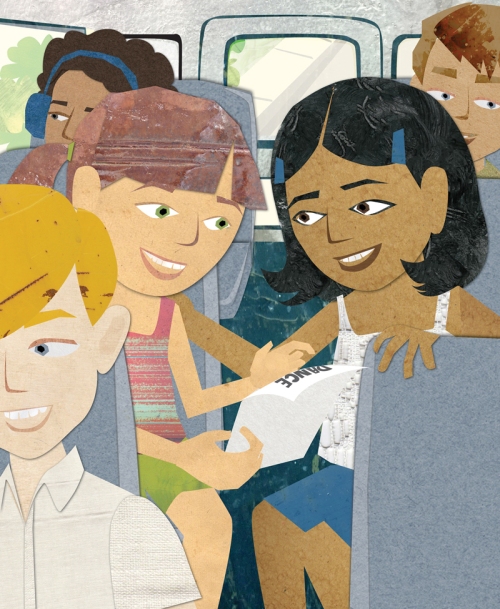
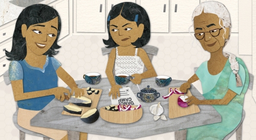
Girls World Dance by Kendra Shedenhelm
I love collage usage in illustration for many reasons, texture being one of them. And I like it’s usage here. Collage can be difficult to do faces and body motion well, but this artist I feel doesn’t struggle with this too much. Their color choices work to the image benefit as well… making us see the eyes and facial expressions instead of other non-essential detail in the artwork. One warning however, be aware always of ‘grain’ with texture used. I feel the horizontal markings in the main brown haired characters hair is distracting as hair grows vertically. The expressions are nicely done here on the bus and at the table. There might have been more expression variety in the non-focus bus scene characters perhaps. If you observe a bus or crowd scene there will be MANY different expressions – not everyone smiles. The two main kids are nicely framed by the others however. Even the back window frame lines tend to lead our eye to their faces. (the dark hair of the kid with ear phones almost draws our eye away)
Girls World Dance by Kendra Shedenhelm
In the table scene we see the same character done nicely again with new expression. We ‘feel’ her conversation even though we don’t ‘read’ it. I also ‘feel’ the relationship between the three women! Love the details of food prep on table without any distraction there. Composition is focused nicely with limited detail and color behind framing the activity at table. (I wish the point in table front wasn’t RIGHT on the border of image however.) I loved the lined ‘molted’ texture in old woman’s arms till I noticed it too in younger women! Overall I feel this artist has done two most effective collage story telling images! The style and detail seems appropriate for educational stories perhaps, and possibly some trade needs. “

The Hermit Crab by Kendra Shedenhelm
Now for the crab images…. again good color usage and page design…simple and clean and focused. Moves the action of the story nicely! Like the characters and situation too….good expression change in a very limited possibility of change! 😉
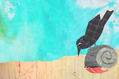
The Hermit Crab by Kendra Shedenhelm
BUT AGAIN….the ‘sand’ looks like a wood fence…the texture/grain of sand (if that’s what it is) is horizontal, and this is vertical. VERY unnecessarily distracting!
Here is a description of the above illustrations from Kendra:
The girls illustrations were for a short story (written by Sona Charaipotra), printed in last month’s Girls’ World magazine.
The hermit crab illustrations are part of a flip book I created for a collage presentation at the local elementary school.
Kendra Shedenhelm is an artist living in Croton-on-Hudson, NY with her husband, their 7 year old son, Archer, and two cats, Tyco and Leo Lionni. You can see more of her work at http://kendrashedenhelm.com/
I want to thank Chris for taking the time to share her expertise with us. It is much appreciated. Here is the CATugeau Agency website link: http://www.catugeau.com/
Chris and I admire the artists who put themselves out there for the betterment of all!
Here’s how you can participate:
For the next few months illustrators can submit two consecutive story illustrations for critique by CATugeau Agency. Each Sunday one illustrator will be chosen and their two 2 SEQUENTIAL illustrations – not just 2 pages of illustrations with the SAME “story/characters” will be featured and discussed.
If you do not have an agent and would like to be featured and hear what you should do or how it could be tweaked to help you sell your work, then please send Two SEQUENTIAL illustrations – not just 2 pages of illustrations, but two with the SAME “story/characters” to:
Kathy.temean (at) gmail.com. Illustrations should be at least 500 pixels wide. Please put ILLUSTRATOR PORTFOLIO in the subject area and include a blurb about yourself that I can use to introduce you to everyone.
If everyone likes this, we will continue until the end of the year.
CALL FOR ILLUSTRATORS: Remember I’m always looking for illustrations I can use with articles I post. Send to: Kathy.temean (at) gmail.com. Put ILLUSTRATION FOR BLOG in the subject area. Remember all illustration need to be 500 pixels wide. Include a blurb about yourself, too.
Talk tomorrow,
Kathy

Love the new blog theme and hearing Chris’ critique!
LikeLike
By: thehungryartist on September 13, 2015
at 10:39 am
What a treat for this Sunday morning, Kathy! Thanks to Christina for her insight and to Kendra for sharing her beautiful work.
LikeLike
By: tphumiruk on September 13, 2015
at 10:45 am
just to make clear again….send two sequential illustrations from the same story, same characters etc. We look forward to seeing and talking about more! 😉
LikeLike
By: catugeau on September 13, 2015
at 12:06 pm
Thank you Christina for taking the time to do this- great insight for all of us to learn from!
LikeLike
By: Lynn Alpert on September 13, 2015
at 1:19 pm
LOVE it — I’ve sent this link to the SCBWI-Michigan email group. I love that you’re doing this, Chris. You’ve always been supportive of and educating to the illustrator community — you too, Kathy Temean — and your advice here is spot on. I hope you’ll continue it for a long time. I’m going to keep spreading the word that it’s here.
For clarification – you say two sequential images from the same story using the same characters. You also mean, two images from sequential pages, right? Not a first and last image from a story, for instance, right?
LikeLike
By: ruthexpress on September 13, 2015
at 1:30 pm
I am so grateful to get this critique, Chris and Christy! Your comments and suggestions were extremely helpful. Thank you, and thanks to Kathy for this opportunity!
LikeLike
By: Kendra on September 14, 2015
at 9:08 pm
It’s a wonderful opportunity for illustrators to learn from these critiques.
I love Kendra’s collage work as well!
LikeLike
By: Iris on September 26, 2015
at 4:33 pm